Your email list contains two types of people.
Some sign up because they’re interested and want to learn more.
And there are some who have already purchased from you, and will purchase again in the future.
Getting people to subscribe is one thing. But actually making any money is a different story altogether.
Here’s how you can squeeze more money out of your existing email list.

Image courtesy of fluffster
1. Increase the Open Rate: Get more people to actually open and read your email message.
and
2. Increase the Click-Through-Rate: Get more people to click on your offer and go to a landing page.
Here’s how you do that.
1. Focus on Creating Opt-In Lists
There’s a big difference between an opt-in list and a forced, opt-out list.
Just to be clear, Opt-out lists are where you automatically have people registered for your email list, and you force them to opt-out. This is considered spam by most people. And it’s illegal in Europe!
Opt-in is where you give people full control whether they want to receive your emails or not. This simple difference has a huge impact on your list’s performance (and it’s a lot more polite).
According to recent data from ClickZ, people that have actively opted in to receive email open and click-through at much higher rates than people that have been added to a list without their knowledge.
How much higher exactly?
Open rates for the opt-in business units were, on average, 82% higher than the open rates garnered by the opt-out business units.
People that willing sign up are much more interested in what you have to say. It may take longer, but the results are worth it.
So what are you supposed to do?
Incentivize and maximize.
Incentivize people to join your list. Give people an immediate, instant-gratification gift that solves a pain point. That could be a free guide, trial, or an exclusive discount. If you make your incentive too unrelated to your ideal customer profile, you would be risking the chance that people would fill in fake or temporary email addresses. Luckily, you can check email addresses and mitigate, and even better pick a highly enthusing incentive and avoid this altogether.
Then maximize the value you send to increase attentiveness and retention rate. Don’t talk about yourself, and don’t send thin content or “fluff”. If you don’t have anything to say, then don’t send anything!
Give people a reason to care!
2. Optimize for Conversions
Conversion optimization focuses on one, primary goal. So it’s the same when you’re optimizing Click-Through-Rates.
What is the main goal of your email?
Every element of your design and message should emphasis one primary goal. People don’t have time to read emails. So your goal isn’t to give them information to read in the body of the email. You want them to immediately click through to your landing page, a strategy often employed in thank you email sequences.
Let’s look at two recent examples I received from different Las Vegas hotels.
In this example, the main goal is for people to make a hotel reservation. Once someone is in the hotel, then you can worry about up-selling them on joining your loyalty program, checking out your shows, and eating at your restaurant.
Now obviously I don’t have any data about how either campaign is performing. But after walking through each, you should be able to tell which one has a higher click-through-rate.
I’m also not trying to be derogatory. These real examples provide a great learning experience, and help you visually compare the principles.
So without further ado, here are two lessons in email conversion optimization.
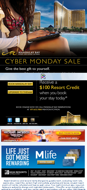
Mandalay Bay
I like Mandalay Bay. It’s a nice hotel, and usually their marketing material is good.
At first blush, it looks really nice. But there’s a few problems with it.
 1. Main image obfuscates. The main image looks nice. It captures their brand’s premise, and conveys luxury. However it confuses the email’s message and makes the goal unclear. It’s too large, and takes over your attention, while pushing the primary calls-to-action down the page.
2. Too many call-to-actions. There are way too many calls-to-action. The two for hotel reservations, four social icons, one phone number, one for the new show, and one for the loyalty rewards program. That equals 9 in one email! It should be one or two max!
3. Major call-to-action too small. Again, the major calls-to-action are hotel reservations. Here they’re giving people the “upgrade” option, which is fine. But these are way too small in proportion to the opening image and the rest of the body.
4. Why include social signals? Do you really want someone to leave the email, and go to another company’s website? No way!
This email looks like it was designed by a committee. It seems like they’re trying to incorporate several different points-of-view and make everyone happy. Design-by-committee kills conversions.
Now let’s compare this one to another example.
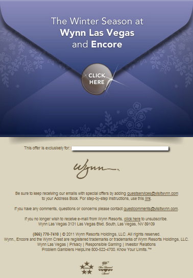
Wynn Las Vegas
Here is the Wynn’s recent email campaign I received.

- One clear, call-to-action. Again, what do you want someone to do when they open this email? Click through to make a reservation. So emphasis that one choice! It even explicitly says “Click Here”.
- Large, very prominent call-to-action. You can’t miss this call-to-action. All of your focus is immediately on this one thing.
- Clear image messaging. What are you supposed to do with an envelope? You open it!
- Ease of split testing. Look at how easy this email would be to split-test. You can easily change the subject line, color of the envelope, headline, and the call-to-action. That would give you real, actionable insight for your next campaign.
Now, which do you think is performing better?
Email marketing is one of the most profitable online channels.
But after getting people to subscribe, you need to improve your email marketing to increase open rates, and increase click-through-rates.


