Copy makes up the most important parts of your landing page.
From the headline, social proof, lead-capture form, to the CTA button—your page relies on language to inspire visitors to action.
If you’re struggling to optimize your landing page copy or are just after some good old word inspiration then this is the copywriting guide for you.
The guide will teach you everything you need to know about writing copy for landing pages to maximize conversions.
From deciding on a landing page structure, creating succinct headlines, highlighting benefits in the body copy, and wooing your audience with social proof, you’ll learn everything you need to know about effective copywriting for landing pages.
But, first, let’s highlight exactly why your copy plays such an important role on landing pages.
Scale insightful marketing content across the web.
We help you grow through expertise, strategy, and the best content on the web.
The role of copy on Landing pages
Ever seen a landing page without any copy on it?
Not likely.
This is because landing pages without copy can’t actually exist. While page design is integral to engaging and converting visitors, it’s copy that explains your offer.
Here’s a visual example of what a landing page would look like if you remove all of the copy and just leave the visually appealing design.
This is what the Liner landing page looks like with all the copy blurred out:
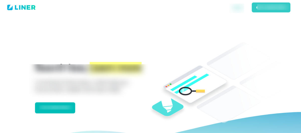
Understand anything? Of course not.
Here’s the page with a copy:
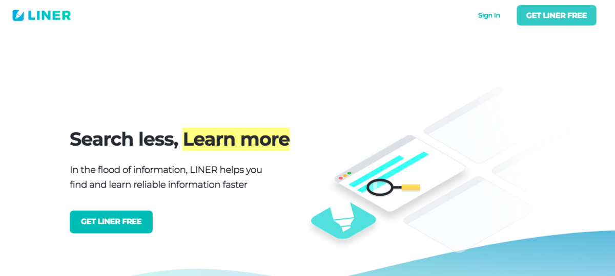
Copy on the Liner page familiarizes visitors with:
- The service’s UVP (unique value proposition)
- The offer
- What their life will look like after Liner
Optimized landing page copy lays the foundation for scoring more advertising conversions because it helps your visitors get familiar with your brand, which makes them more likely to convert into customers.
How? At its core, copywriting is about persuasion. It’s about relaying the right message at the right time to convince your audience to take action. This involves framing and structuring information so that more visitors decide to click the CTA button, whether you’re offering a free trial, an ebook, or any other incentive that gets people to convert.
Persuasion translates into conversions and sales.
Want to write copy that persuades visitors into converting? Here’s everything you should be doing.
Start with your UVP
Before starting with the page copy, it is important to determine your unique value proposition. What makes your offer different/superior to the competition?
Tailor your UVP to address the specific audience you’re talking to. Then create a statement that describes:
- What you’re offering
- Why people should want it
- How it separates you from your competitors
This statement should influence all the copy on your page—from the headline to the CTA button copy.
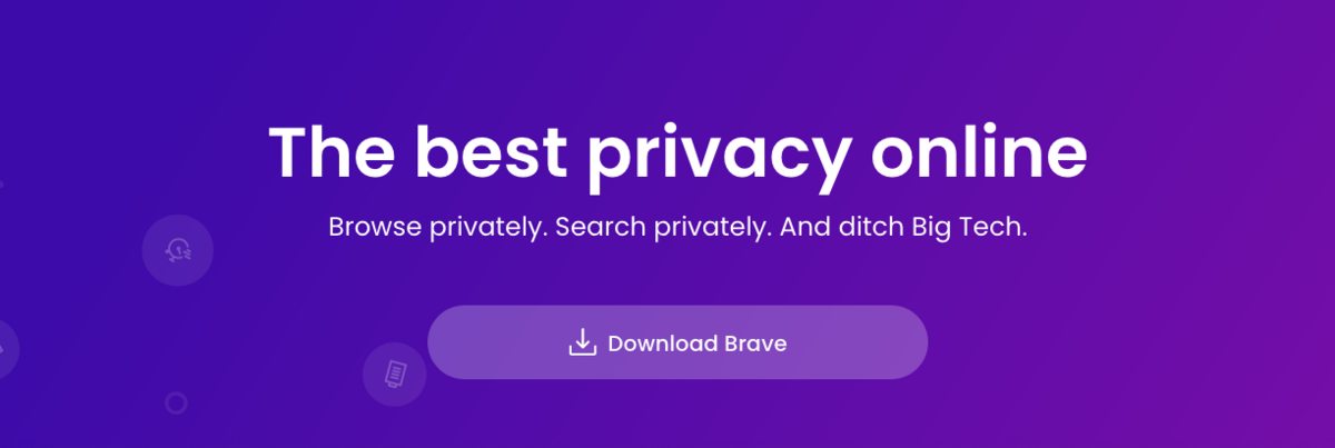
Brave, a privacy-first browser, features their UVP in the page headline.
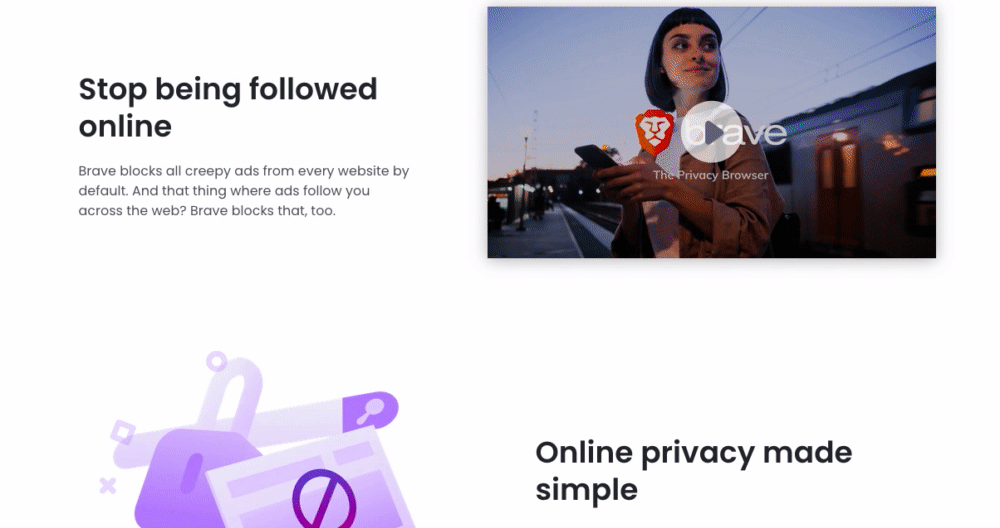
The page copy below the fold also focuses on the UVP, ensuring that visitors who scroll down to learn more know just how important their privacy is to Brave.
Frame the UVP in a way that puts your visitors’ needs first. Consider:
- What benefits will they get when they click the CTA button?
- How will their lives be different?
- What pain point will the offer alleviate?
To check if your page is communicating what makes your service/offer unique, run a quick 5-second test. This helps you ascertain if someone skimming your page can understand what the service does and how it helps visitors.
After you’ve created your value statement, you need to ensure your pre,-and post-click copy is message-matched.
Think about message match
61% of online users wish more companies would prioritize personalization.
Establishing message match between your ads and landing pages lays the foundation of providing a relevant experience that boosts advertising conversions and increases your return on ad spend.
Message matching involves meeting visitors’ expectations from the ad to the landing page. When you match the copy and visual design of your targeted ad to the landing page, you deliver on the promise you made that got them interested in the offer in the first place. A well-designed website design plays a crucial role in maintaining a seamless user experience from the ad to the landing page. Clear navigation, responsive layouts, and visually appealing elements ensure that visitors can easily find the information they were promised.
According to Joey Sasson, Vice President of Sales & Logistics at Moving APT, “The idea is to provide visitors with a consistent experience on their path to conversion. The more they feel the ad and page are relevant, the more likely they’re to convert.”
For example, Typeform’s ad and landing page share the same messaging and offer. The ad talks about creating forms through “personalized lead gen your audience will love” and the ad CTA button asks users to “Sign up” to try Typeform for free.
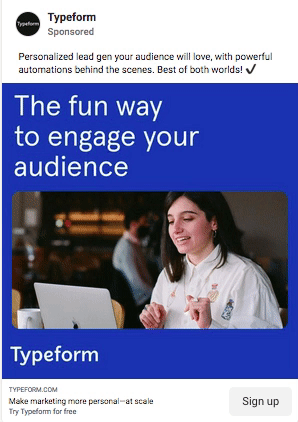
The landing page copy reiterates the same messaging, it explains how visitors will be able to grow their audience through conversational forms that will get them valuable lead data. The CTA button on both the ad and page are identical—sign up for Typeform for free.

Decide on visual hierarchy
Think of visual hierarchy as the blueprint of your landing page. It decides the order of page elements based on their importance in getting the visitor to convert.
When deciding on visual hierarchy, keep the following factors in mind. These will help you create a copy layout that will get visitors to click the CTA button.
- Differentiators: What makes your offer unique? How is it different from the competition?
- Pain Points: What are the problems that your offer helps visitors solve? What pain are you alleviating for them?
- Benefits: What value is your offer giving to customers, what does it allow them to do?
- Sales objections: What could prevent your visitors from clicking the CTA button?
- Call to Action: How will visitors access your offer? What happens when they click the button or fill out the form?
Keep these factors in mind when deciding the order of copy on your page. To create the page hierarchy, you can also use visual page patterns based on eye-tracking studies, like the F-pattern and Z-pattern.
Create the copy in a clear flow that persuades visitors to continue to scroll down the page and finally click the CTA button.
How to write copy for each page element
After you’ve decided on the visual hierarchy, it’s time to write a copy for each element. Here are some best practices that will help you craft optimized page copy.
Headline
As it’s the first thing the visitors see, the headline should summarize your offer in a brief but compelling way. Don’t compromise on clarity by trying to be clever or funny. The headline should be succinct and hook visitors so they would want to scroll down the page and give your offer a chance.
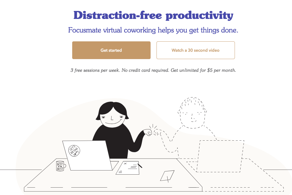
Focusmate’s landing page headline is short and highlights the UVP. It talks about distraction-free productivity in the virtual world.
Body Copy
The purpose of the body copy is to convey essential information visitors need to know about your offer.
Although, it’s common to see brands touting their newest features and additions to the product. It is essential to prioritize user benefits over product features on your landing pages because the former helps persuade visitors to claim your offer.
So, instead of writing a copy that says “this is what the product does” say “You can do this with the product”. Explain things from the user’s point of view to get them to identify with the offer.
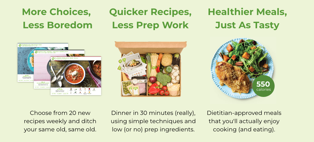
The Hello Fresh landing page showcases user benefits to make it easy for visitors to visualize how the service will make their lives easier.
Social Proof
Social proof in the form of testimonials, customer logos, and reviews helps establish trust and credibility for your offer by showcasing the trust that your current customers have in your brand. Compelling social proof reiterates what you’re saying in the rest of your page copy.
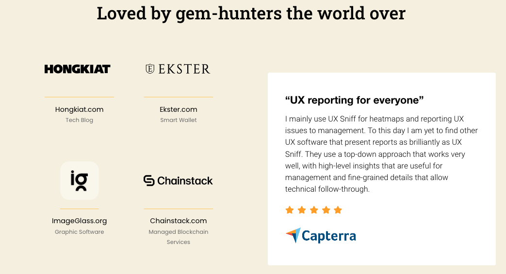
The user experience platform UXsniff features social proof with a testimonial that reaffirms the service’s UVP. Plus, the fact that the review is from a third-party website (Capterra) adds to the positive effect the testimonial will have on potential customers.
Call to action
The CTA button copy is the last step visitors need to complete to convert. The button copy needs to be relevant to the offer, clearly explain what visitors should expect after clicking the button, and be action-oriented.
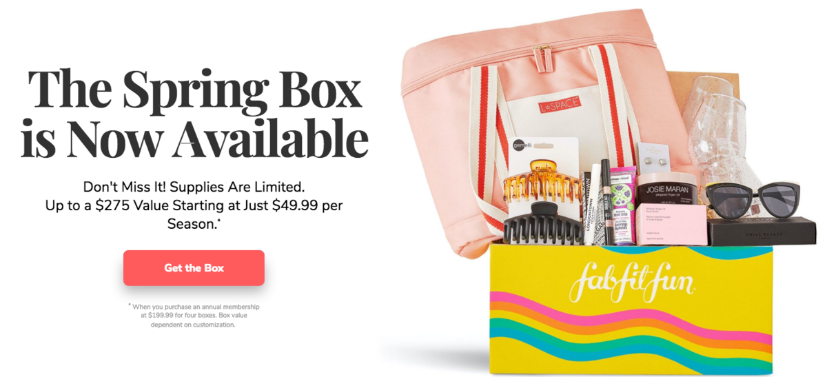
FabFitFun’s CTA copy is relevant to the “Spring Box” offer, it tells visitors that they’ll “Get the Box” when they click the button, and it uses an action word.
Get your landing page copy right every time
Copy is one of the most critical landing page elements, you need to optimize your copy to lay the proper foundation for the rest of your page.
Use the best practices outlined in the post to craft copy that helps visitors see the value in your offer, so they can convert with confidence. More conversions lead to a higher return on ad spend which translates into more growth for your brand. And it all starts with the right words in the right place.


