It’s not that most blog KPI’s are purposefully bad.
They’re just misguided.
They’re well-intentioned. But ultimately askew. And it leads to poor perceived performance (plus even worse investment).
Key performance indicators that aren’t aligned with the business objectives are like sales reps wasting all their time schmoozing prospects who can’t buy.
Here’s why most blog KPIs are wrong, and how you can right the ship before it’s too late.
Contents |
|---|
Why (most) traditional blog KPIs suck
Quick:
What’s the ROI of social media? What’s the ROI of content?
And how do you know if it’s ‘working’ or not?
If you’re like most, the shortlist of blog KPIs typically looks a little something like:
- Visits
- Pageviews
- Links
- Social shares
- Rankings
These are fine KPIs. For email marketing, social media engagement, and organic traffic.
But not for a blog. Not for content.
These indicators have little do with customer acquisition, which is the ultimate test when it comes to business goals and OKRs.
Because creation isn’t distribution.
The best content, published on a new site in a vacuum, will languish in obscurity. The only way to drive visits, increase page views, grow website traffic, boost the click-through rate, generate backlinks, encourage social shares, and move up in the rankings, is to focus on distribution. On promotion. On actually telling A LOT of people about the good work you just did.
Big brands don’t have this same problem necessarily. The HubSpot’s of the world can hit “Publish,” sit back and throw their feet up, while other people do the distribution for them. Pretty soon? Page one, number one.
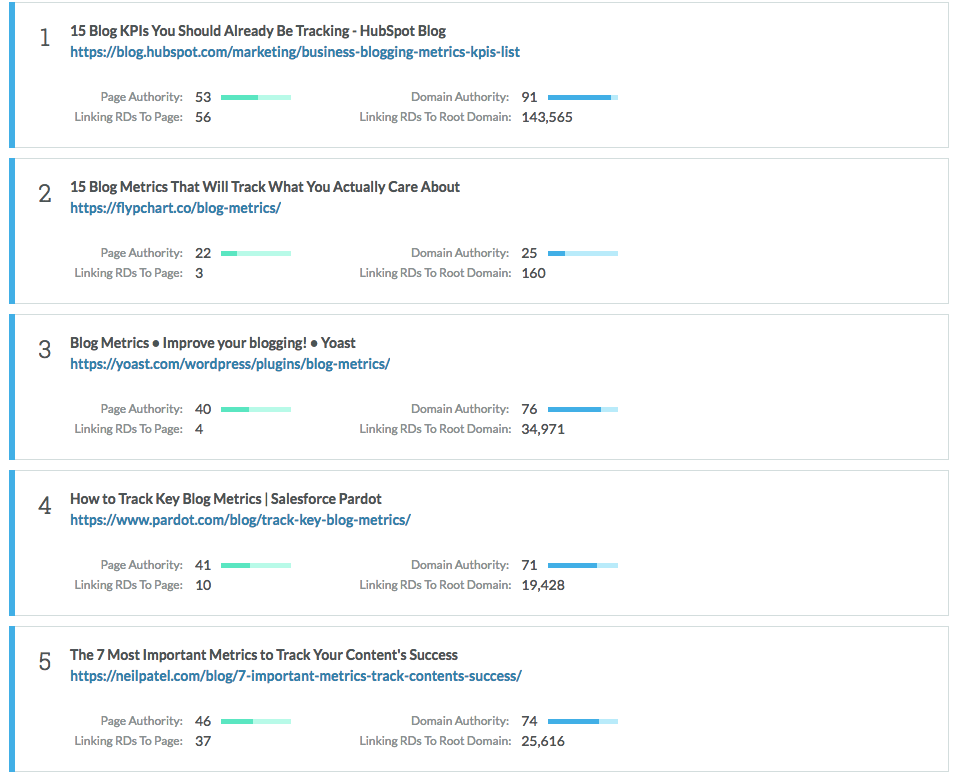
That’s not a knock. There’s a reason HubSpot’s HubSpot.
But domain authority (as a proxy for brand awareness) often trumps keywords. (Little “t” again.) Content quality determines the rest.
So visits, pageviews, links, social shares, ”domains that have protection with dmarc report,” and rankings are leading indicators of successful lead generation. IF you’re measuring promotion or distribution.
Not if you’re measuring a blog’s worth, though. Because you’re only seeing a tiny slice of the overall value. A slice that people creating stuff for said blog almost never have complete control over.
Worse still, a lot of Blog KPIs don’t even link to the sales funnel in any way. Very often the site visitor isn’t converting to a customer, and the analytics can’t help you understand why.
It’s time to broaden those blog KPIs to get an accurate, complete picture of what’s actually going on. Here’s where to start.
1. Engagement
Google Analytics can instantly tell you which posts are most popular.
Simply navigate to the Behavior tab, and then dive down into All Pages under Site Content. For bonus points, you can even add a Secondary Dimension to analyze how traffic sources impact content performance. (Short answer: They do.)

Now, that one’s a little tough to read.
Let’s zoom in on a specific blog post. Let’s focus on The Big Daddy post that brings in the most visits and pageviews. Let’s see why those blog metrics are garbage when you dig below the surface.

Sure. This post is A-M-A-Z-I-N-G on the surface. But engagement-based metrics reveal that it’s actually a turd. The average Exit Rate for the site is ~69% (don’t giggle), but the exit rate for this page is at 86%.
That means the vast majority of peeps arriving hit the “Back” button before you can even introduce them to your wares.
And that means you’ll be struggling to explain to your boss or client why sales and new customers are down even though blog traffic is UP, UP, UP.
Here’s the shortlist of engagement-based metrics to start with:
✅ Time on page
Generally speaking, the more time on site, the better chance of snagging potential customers.
It means people are sticking around, not bouncing or exiting, and increasing the chances you’ll get at driving them into another page or some other micro-conversion (more on those below).
But context matters.
You don’t want people sticking around on a landing page forever. Especially, if it’s a shorter one. So time on page is good for content-heavy ones, but not always so good for others.
✅ Bounce rates
Careful with this one. Bounce rates can be notoriously unreliable.
For example, bounce rates on content sites tends to be higher than commercial ones (again, often due to the traffic source and lack of intent).
Sitewide bounce rates are often useless, so you’ll need to compare or benchmark individual pages.
Plus, high bounce rates on individual pages isn’t necessarily a bad thing if the conversion rate is also solid. So be careful with this one.
✅ Exit rates
Self-explanatory. People are leaving your site from this page.
That’s not necessarily a good thing on a blog.
Blogs should be sticky. That’s basic content strategy. People should land and get stuck long enough for you to funnel them to a point of conversion.
High exit rates on individual posts means that there’s a problem (with the content, with the layout, with your CTA’s, etc.).
✅ Dwell time
Dwell time essentially helps you predict how much users like that page, while also giving Google the very same information.
It helps add a little of this nuance and context that other metrics, like Bounce rates, tend to leave out.
How to improve blog engagement KPIs?
Size doesn’t always matter.
Take Skyscrapers for instance. 10k words is great for SEO. Not so great for actual human beings. Because no one (or at least, the ones you want who’re gonna pay you a whole lotta cash), don’t have time to weed through that crap.
They key comes down to content consumption, then. Not just length.
More media types is the first tip. Custom images, flow charts, infographics, audio narration, and of course, video, all help people consume content quicker — giving them motivation to stick around.
Or, click around.
Internal links and related posts are the simplest option. Beyond the site architecture benefits, both options give people a reason to hang out just a bit longer.
Long enough, hopefully, to get an email, trial, or credit card.
2. Quality
Content quality is a tough one to nail down.
It’s admittedly intangible. It can be subjective.
(We bought and tested five content writing services to illustrate this problem.)
However, a ‘balanced scorecard’ approach can yield results. MarketMuse attempts to fill that gap (at a pretty penny). And Nadya Khoja presents an excellent data-driven approach.
Once you have something like this, results should come consistently. Because all else being equal, the best content wins.
For example, our first foray into the competitive personal finance affiliate space resulted in best-in-class scores from MarketMuse. Despite this being our first go-around, with zero prior experience.
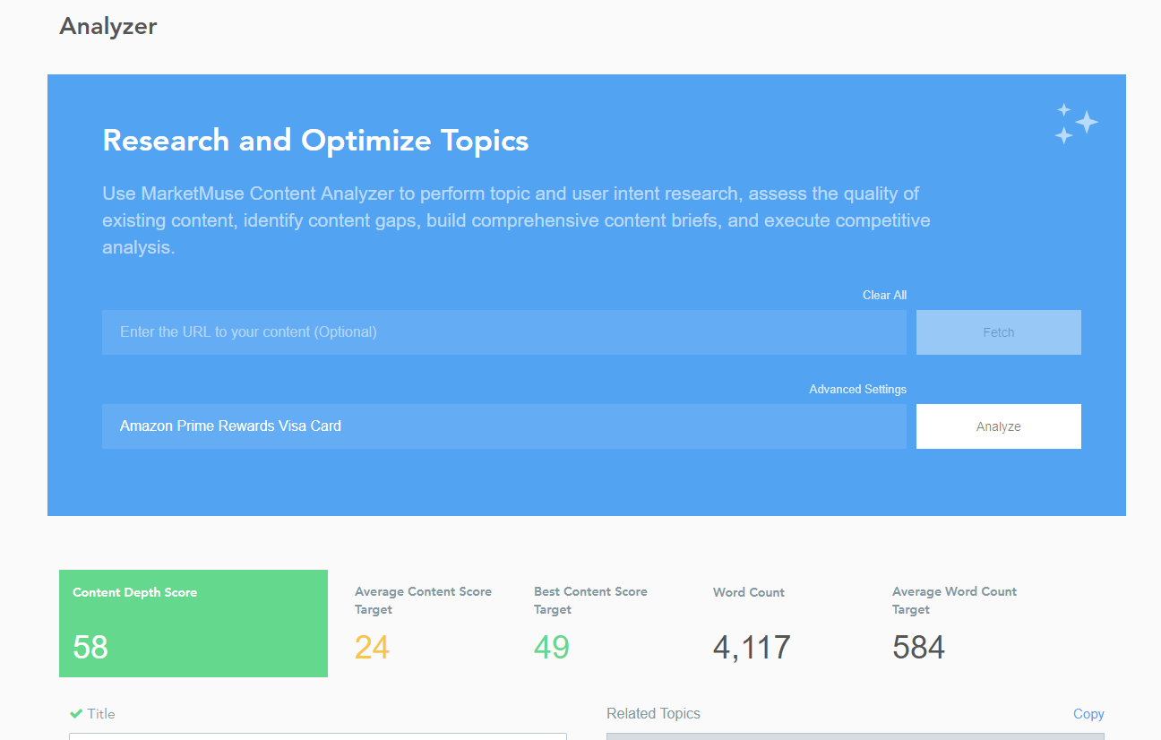
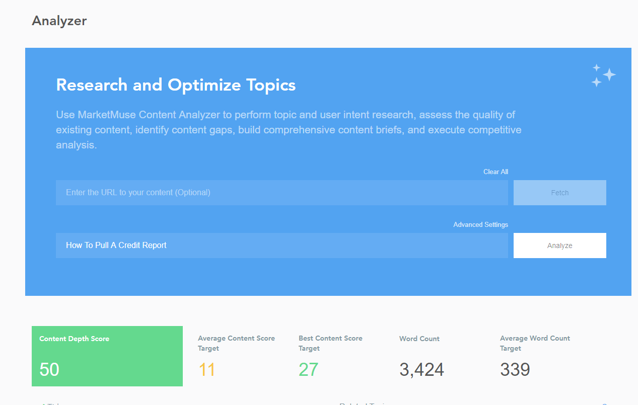
It’s not a fluke. It’s what we do. We have internal processes and systems in place to produce a certain style of content that nets client’s a certain type of result — no matter which vertical, topic, or site.
Here are a few of those things to evaluate.
✅ Readability
The Flesch–Kincaid test boils down readability into a simple score that approximates comprehension with reading level.
It weighs up things like word count, word syllables, and sentences to help pinpoint how easy (or difficult) something is to read. A higher score means a lower grade level (~90-100 = 5th grade), while a lower one equals a higher grade (~30 = college graduate).
In most cases, aim for a lower grade level (i.e. higher score). You want to make something easier to read. Especially if it’s long.
That’s not because people are dumb. (Well, some are.)
But because people multitask online. You’re almost never getting their undivided attention. Which means any additional speed bumps you throw in their way (like complex language, dense paragraphs, etc.) will ultimately deter them from finishing.
Be careful, though.
Just because an audience is more sophisticated doesn’t mean you start throwing complex jargon around. The words used should still be simple. The sentences you write should still be simple. Compound ones should be used sparingly.
The true sign someone knows what they’re talking about is by being able to clearly communicate the meaning.
Here’s how to do that.
✅ Concision
What’s wrong with this example?
Nothing on the surface.
It wouldn’t be out of place in half a dozen Skyscrapers you read right now.
However, just because it’s not wrong doesn’t mean it’s good.
That sentence above can be reduced to:
“Lead magnets can generate more leads for your business.”
Much better, right? Almost rolls off the tongue.
Now. Here’s where most smart people get stupid.
Smart readers = long, complex prose. Right?
Wrong. Not when people have an iPhone and iPad in front of the iMac they’re reading. Not when they have Slack firing off messages every 1.3 seconds. Not when their coworkers keep barging into their office unannounced.
This ain’t brain surgery. We’re not writing dissertations.
So drop the formal language, flowery adjectives, and F-ing thesaurus.
Word choice matters more than word count.
If it was good enough for Hemingway, it’s probably good for us, too.
✅ Voice
I’ll admit. I’m guilty as charged.
Personally, I could care less about grammar. (As you’ve probably noted here a few time already.)
Clients do, so we have copy editors proofread everything. But my definition of ‘good’ content comes back to:
- Is it saying something worth saying?
- Is it enjoyable to read?
Look.
You think this is the first post on blog KPIs? Nope. Google says there are 7,860,000 other results. And this isn’t even a popular topic compared to stuff in the real world. (Keyboard cat has 173,000,000 alone.)
We might all be special snowflakes. But our content isn’t.
Which means the thing that ultimately sets it apart is the way in which you go about doing it.
Which means there’s a problem, because it’s almost innate. You can’t graph it or chart it or Excel it.
Which means this, above all the others, is the least quantitative KPI on the list.
How to improve blog quality?
MarketMuse is attempting to provide a ‘balanced scorecard.’ They’re further than most.
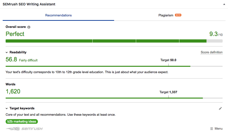
SEMrush has also made headway with their SEO Content Template and SEO Writing Assistant.
You can drop in a keyphrase and get back some basic, aggregate data about your SERP competition.
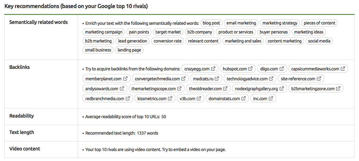
Then, you can fire up the Writing Assistant inside WordPress or on a Google Doc to compare and contrast how you’re doing.
Beyond SEMrush, the Hemingway App can help with concision.
Run everything through there for a few weeks until your copy comes out clean and crisp.
Otherwise, voice is up for debate. ‘Style’ doesn’t mean ‘quality.’ It’s more a personal preference, as opposed to an unbiased review.
Experience can help you spot the difference. But otherwise, there’s no quick fix or tool to shortcut years spent writing and editing.
3. Results
Big picture, content exists for one reason:
To move someone from A to B.
To take the problem-aware, and make them solution-aware.
To take the doubters and turn them into believers.
However…
Most traditional KPIs here fail, too.
For example, the usual suspects typically include opt-in rates, free trial rates, upgrades, and more. But just like before with promotion-based metrics, these have an indirect influence. They’re the end result.
Which content may (or in most cases definitely can’t) influence directly.
Marketing is 99.97% reactionary.
I just completely made up that stat. But the point is that if you don’t have product/market fit, if you aren’t targeting the right personas, if you don’t understand why they buy, and if your initial offer isn’t good/easy/affordable/valuable… all the promotion in the world can’t save you.
Which means all the content in the world won’t save you, either.
The same holds true when measuring blog conversions. The most amazing content won’t make a dent for your business if the initial offer you’re sending people to isn’t good enough.
So here’s what to focus on to drive results, instead.
✅ Micro-conversions
Macro-conversions are often overrated. Just ask Avanish.
They’re simply the culmination of many micro-conversions up to that point.
Want to influence the ultimate conversion? The free trial or signup or upgrade?
Start by moving the needle on all of the tiny actions that lead up to that point.
Now, we’re not talking about sending people through an endless loop of TOFU ebook > TOFU checklist > MOFU webinar > MOFU comparison page > BOFU pricing page > BOFU lead score notification > BOFU demo, until one day, 74.6 years from now, they hopefully, fingers crossed, Pray to God, convert.
No. We’re talking about each tiny interaction that gets them one step closer to ultimately converting (in the least amount of sessions possible).
✅ Visitor path
If a website conversion doesn’t just happen, it means there were a lot of little steps that generated them.
User flows are already happening whether they’re purposeful or not. People are taking one step, then another, then another.
And along each point, a certain percentage of them drops off.
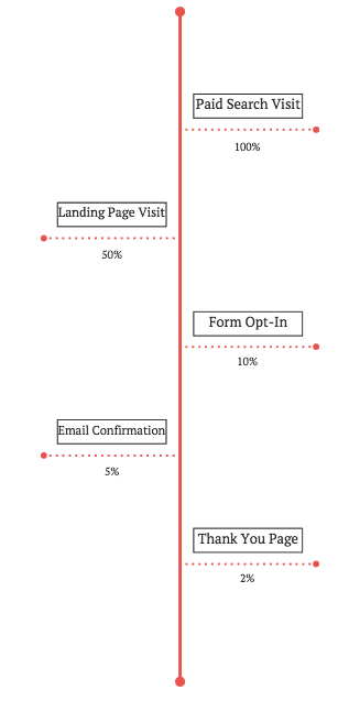
Think of it like an onboarding sequence, except Pre-Conversion, across your content.
The trick is to hone-in on those micro-conversions and improve the percentage of people going from one to the next.
How to improve blog results?
You can use content to sell.
However, it needs help.
If your product costs <$100, you can send them to purchase. However if it’s >$10k, you can’t.
That’s where tricks like content upgrades or lead magnets can help break up the purchasing event. It gets you one small commitment that you can build on.
You can (and should) also use employe product splintering and tripwires.
Think about it.
Purchasing intent is rare in content sessions. Especially blog and other awareness-based stuff. Therefore, the likelihood of driving direct signups is rare.
Change your offer to appeal to these people, then. Take advantage of urgency or impulse to get a small commitment.
Productize high-end services to offer a tangible, low-ish barrier to entry offer that gets them thinking.
I realize stuff like ‘product splintering’ and ‘tripwires’ sound like info-peddaling BS.
But it ain’t new. Good marketing ain’t new.
Exhibit A is from the 60s, making it a ~58 year-old best practice for your content in 2018.
Conclusion
Blog KPIs like visits pageviews, rankings, or social shares are fine…
IF you’re overlaying them with additional context about engagement, quality, and results.
Business analytics like total revenue and profit margin mean very different things depending on the context and company goals. So it is with marketing metrics.
It’s tricky because every situation is different. Every blog for every company has unique objectives.
Just make sure those digital marketing KPIs and objectives are good, and not bad.
‘Good’ means content directly influences them. It means there’s some level of control.
‘Bad’ means indirect influence. It means you’re judging one thing for the results of another.
Content isn’t always king in this case. Context is, because it can’t do it alone.


