

In this article
In a perfect internet, there’d be no marketing.
Customers would just know, as if by divine gift, when and where to find us when the time was right. No banners needed. No lead magnets or SEO.
It’d be a beautiful world with user experiences (UX) so natural they’re almost thoughtless.
Obviously, this isn’t the internet we live in.
The one we live in requires marketers to put on their promotional caps and wrangle leads in like bulls in the pasture. And it means, more often than not, that the UX has to get trampled a bit.
It’s the only way, right? Give up a bit of the user’s convenience for the sake of your sales. You have to balance usability against profitability. It just can’t work any other way.

Yeah, no.
That’s a lazy ass way to look at things.
Usability Is Not a Choice. But Your Business Is.
Notice that I say usability and not UX. They’re not interchangeable, despite what every blog-certified joke with a copy of Photoshop tells you. They’re distinct entities.
Related, yes. Linked on a fundamental, cosmic level of correlation.
But not the same thing. UX is a subjective matter of preference and what you — necessarily — have to sacrifice and tweak for profitability.
Usability is objective. It’s even directly visible on tools like heatmaps. Usability can’t be thrown under the bus for the sake of ticket sales, because it’s the damn road the bus needs to be on.
And lest there be any ambiguity: this piece is specifically for you, marketers. Because your websites are hands-down the worst offenders against usability.
Despite the fact that several of the top ranking factors for your pages relate back to usability.

So let’s put this out in the open:
Usability is not a choice. When your marketing efforts impede the usability of your site, you’re undermining your business. Because you know what is a choice?
Shopping with you. Subscribing to you.
You are a choice. And if your marketing is killing your usability, you’re a bad one.
Don’t Make Me Click. It’s Exhausting.
“OK, cool, you’re throwing a fit,” you’re probably thinking, “But you haven’t actually told me what the hell I’m doing wrong.”
For one, you’re making me click. A-effing-ton. Before I ever get to see the content I came for.
Let’s walk through an example.
Note:
I’m not going to include links and, whenever possible, I’m going to blur brand names and identifying features because I don’t want to tear down other marketers.
I respect the hustle. I don’t think they deserve to be highlighted for this behavior when, honestly, they probably don’t know what they’re doing wrong.
If you have a problem with that, go back to high school.
/end note.
I searched for updated SEO tricks in Google. Opened a page. Scrolled a millimeter:
I haven’t even seen the page beneath.
Now I’m being treated like a child and forced to click on a condescending “No, I don’t like traffic” option before I’ve read a single word of the content that I came here for.
So I’m going to bounce. This approach doesn’t work on Tinder, and it doesn’t work on searchers. Quit shoving your lead magnet in my face. I’m not interested.
Let’s check another example.

I didn’t even have to scroll. Both of these were taking over my entire screen within two seconds of landing.
Boy, bye.
Sadly, neither of these are even close to the worst I’ve seen.
The worst offenders set me up on a path like this:
- I click on their link from the SERP.
- I click past their lead magnet modal.
- I deny their request for desktop notification access.
- I click out of the “live chat” window I never asked for.
- I hit accept or decline on the cookie notification.
- I finally see the content! Probably with another email subscription box. Oh, joy.

It’s too much. You aren’t nurturing me as a lead. You’re putting me in a new, thus far undiscovered sales funnel that skips straight from awareness to annoyance.
Yes, You Can Have Your Cake and Eat It, Too
Look. I like marketing. If it didn’t exist, I’d be out of a job.
What I’m against is lazy marketing. Marketing that isn’t user-conscious.
It’s not hard to do it better. It doesn’t require you to scale your market budget by 5000%.
It just needs you to take a little time and apply some empathy for the audience you’re trying to persuade.
And to look at what they hate and then not do that.

In the context of this study, a modal refers to any ad that appears on top of the content and prevents users from interacting with the material beneath before they close it.
I.e., a lightbox.
And yes, your subscription boxes and lead magnets count as an ad in this frame, monetary reward notwithstanding. They’re advertising something (you) to the visitors.
So where does that leave you? What are some steps you can take to improve your usability without sacrificing your marketing?
You can try:
- Making the offer when it’s relevant. Not when I first land. I didn’t come here for your ebook. Chill.
- Showing me content that doesn’t suck before you ask for my digits.
- Giving me non-intrusive — but clear — CTAs. If you’ve followed the above advice and your content is engaging, you won’t need a bullhorn to make me sign up.
- Conducting usability testing to ensure your site is user-friendly and doesn’t frustrate your visitors.
Kinsta does this really well. They stick their subscription boxes in the middle of their articles, like so:

Why this works:
- The user has gotten a chance to browse the content they came looking for.
- The writer has had a chance to make a case about the value of their copy (i.e., they’ve probably been read, or at least skimmed, by the time someone gets to the ask box).
- You’re less likely to lose users by having it in the middle than at the bottom. 3,000-word articles are a lot to get through, even if they’re well-written.
Which isn’t to say that you can’t put your content upgrades, subscription boxes, and whatever sign-up you’re running at the bottom of your articles.
In fact, it’s probably a smart idea to have your sign-ups in multiple locations.
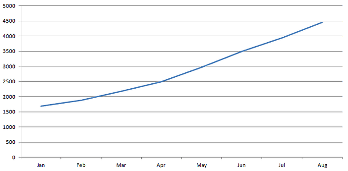
CodeinWP grew their email list up to 450-500 new sign-ups a month by leveraging content upgrades and adding multiple sign-up forms to their user flow.
You can spy their growth trajectory below. That’s a nice slope – you can even use a slope formula calculator to calculate it if you want!
The key to copying CodeinWP is to leverage these techniques without getting in users’ way. You can spy it on their blog, or check out Invesp for inspiration.
Look how they position their multiple lead magnets and subscription boxes on their blog without preventing the user from, you know, actually using the blog.
Here they are in a side panel configuration:

Tons of opportunities for me to convert. None of which act as barricades to my goals or prevent me from completing my tasks efficiently.
Be like CodeinWP and Invesp.
No, This Isn’t the Designer’s Job Alone
So far, I’ve talked a lot about being user-conscious with your marketing. Enough so that you might think, “Great, I’ll tell my designer.”
And you should. But it isn’t just their job. It’s yours, too. At least, if you give a damn about CRO, which is increasingly becoming intertwined with usability and UX.
I’d argue that they’re the same process, even. Just with different end goals.
I’m not alone in this perspective, either.
Per Axbom, a UX designer with the coolest name ever, explains his thoughts:
“I myself see conversion optimization as a subset of actionable UX.”
And in a more perfect internet, it is.
Conclusion
Let’s create that internet, marketers. Let’s make it a place where we aren’t sacrificing users for profitability and conversions aren’t an either/or equation with usability.
Just remember:
- Usability isn’t a choice. It’s a requirement.
- The more barriers and clicks you put in someone’s way, the more likely they are to bounce. I.e., say goodbye to your SEO juice.
- You can market and utilize lead magnets. You should do it in multiple places, even. Just as long as none of those places impede the user’s goals.
- Your designers should be in on this conversation, but it’s not a conversation for them alone. If you’re down for CRO, you need to be down for user-conscious marketing.
This isn’t a manifesto, but it is a CTA. One where we, as marketers, take responsibility for our customers and help create a better internet by putting users’ needs alongside business needs.
It won’t always be easy. But nothing worth doing ever is.